Friday, September 30, 2011

Project 3A : Black Box (pictorial)


Assalamuaalaikum...


On last Monday, i was given an assignment that need me to create a model of 8 boxes.
The size of the cubes are 1 span of long, 1 span of wide and 1 span of high.
On a cube, there must be six colours on six surfaces respectively and the colours are repeated on the other 7 cubes.
then, the 8 cubes, need to be arranged to form a new shape.
then draw an orthographic drawing of the model.

So, the first step i did was, planning on how i want to create those cubes.


then, when the size and the template were determined,
i cut out the template of the cubes from a thick art card.


then, choosing the six colours to put on my cubes.
After trying many colours, i finally choose 6 colours that are yellow, yellow green, pink, purple, light blue and orange.


After making the template into cubes, the cubes were coloured with the six colours on each surface.
Then, comes the time to arrange the cubes into a desired shapes and design.
I had tried so many times to arrange and rearrange the cubes until i get the shapes and design that i satisfied.


Here is my model, finally.
I arranged the cubes with blue, purple and pink on the front model,
with the green, yellow and orange at the back of the model.

I make it into this style because i want the two concept to be in my model.
The blue, purple and pink colours are arranged together creating the mood of softness, beauty and calmness.

At the other sides of the model, which is the back, there are yellow green, yellow and orange,
together forming feel of activeness and cheerful.

about the design of the model,
the basic shape is actually square,
but with some modification, it turn out to be like in the picture.

I think that my model is unique in form of it design.
But, with more education gained later, i really hope i can improve the lacking in my designing skills.

Here is my orthographic drawing.
This is not the final one, as i forgot to snap picture of it as i'm done with it.


Really hopes that i can improve my skills in drawing and designing.
And i will put more effort to be better.
:)


Monday, September 26, 2011

Project 2B


Assalamualaikum
Assignment again. Project 2B.
This project need students to produce a Geometrical Shape Design based on natural structure.

Then, the pattern need to be coloured with basic colour tone to suit the patterns.

So, the first step i did was, thinking about the natural structure and finally i was attracted with bundle of roses.


From the appreciation of this natural structure,
i came out with a geometrical design of roses.


So here are the geometrical design of roses.
I coloured the background first with light blue using water colour.
The light blue is the mixture of blue and white.

Then, i coloured the roses geometrical design with pink and some shading with dark purple.
Pink colour is the mixture of red and white, while the dark purple is the mixture of red and blue.
So, basically, i used basic colours for this project.

For the background, the colouring technique is 'basah atas basah' and for the roses I used 'basah atas kering' technique which can be used when we are painting using poster or water colour.


So, this is how my project looks like at last.
:)

Thursday, September 22, 2011

Form and Structure


Project 2A : MAN-MADE STRUCTURE ( FORM AND STRUCTURE)

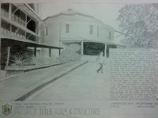
In this project students required to produce a sketch of the School of HBP building from the angle that may deem appropriate and do some writing and description.

So, the first step that I do for this project was walk around School of HBP and captured few photos of buildings from different angles that I found interesting to be in my 2A project. From about ten pictures, I shortlisted about 4 photos that I think most suitable. Then, I printed out the pictures in black and white so it is easier for me to sketch using various grade of pencils with different tones of shading.


After looking again at these pictures, I finally decided to take the picture of The Drum to be in my sketching, the top picture in the photo above. Below are the real of it.

I'm choosing this building because of it's unique shape and design. It looks like a big drum, so it is called as The Drum by the lecturers and seniors there. I choose the angle of front view because i think that it is the most suitable angle as i can also sketch the buildings that connected or attached together with The Drum and it can clearly shows the unique shape of it.
Actually, Te Drum function as the main building of School of HBP as the office of HBP is located inside this building where students and lecturers always go there for any bisness related with the office.

I start sketching the building roughly on my sketch book, then only i sketch seriously on A3 cartridge paper.


Then i draw the outline of the figures inside the picture.


After that, i start do detailing on each figures by rendering using various techniques such as hatching, crosshatching and tonal render.


And finally, I was done doing it, with the description written on the below right side of the A3 cartridge paper.. :)


And here it is...

Photobucket

At first, I think that it is a tough task for second assignment, but when i doing my sketching, i realised that i learned so many thing such as, i can practice and have more understanding of what i learned in this topics about planes, lines and etc. . I also can improve my drawing skills by doing this besides, it a training to prepare me to be a good architect in the future.

:)

Saturday, September 17, 2011

Project 1B : ME, MYSELF & I


Assignment 1

Project 1B : ME, MYSELF & I
( Tone and Texture )

This assignment needs me to produce an essay that briefly elaborate my identity using pencil.
It also need me to draw face sketch in size of 130 x 130 mm.

And i choose hatching technique to render the face sketch.
Besides that, i also use scale technique in the process of sketching my face in order to make it better with guidance of the scale i made.

I choose this picture to make my face sketch, and i focus only on the face.


I made scale on the picture printed in black and white and also on the A3 catridge paper.


Kemudian, lakaran wajah dilukis dan mula di renderkan dengan teknik hatching.

dan ini adalah hasil 'face sketch' yang telah saya hasilkan untuk Project 1B.

Project 1A : MY LINK ( LINE AND SHAPE )


Assignment 1


Date : 12 September 2011
Submission date : 19 September 2011

Projek ini memerlukan pelajar untuk menghasilkan Logo Pelajar sendiri
yang berukuran 230 x 230 mm dan mestilah berwarna.


Beberapa lakaran logo telah dihasilkan...
Logo yang paling sesuai dipilih untuk menjadi logo pelajar saya.


Kemudian, logo tadi dilakarkan semula di atas kertas cartridge bersaiz A3 mengikut format yang telah ditetapkan berserta penerangan idea dan proses penghasilan logo.


Logo pelajar tersebut diwarnakan dan seterusnya penerangan idea dan proses penghasilan ditulis di sebelah kanan kertas A3 tersebut.
Kemasan terakhir dilakukan dengan melekatkan kertas tersebut di atas sekeping mounting board hitam.


Inilah hasil kerja saya untuk projek 1A.
:)

Assalamualaikum...
This blog is specially created to be my official web page for assignments and projects
of RUS 104 course, Integrated Studio 1.